This page shows how to create a spider diagram in excel using a two way table. Spider diagrams show the range in an output for different variables. The spider diagram is created with a two way data table where you use percentage factors rather than absolute numbers when you make your scenario analysis. Spider diagrams have the percentages that change the various different variables on the x-axis as illustrated below. To create spider diagrams you need to isolate on one output variable such as the value of the company or the IRR etc. which is then put between the row and the column like for any data table. Then, you can see how this variable changes when you change the sensitivity percent. But you want to do this for many variables. This means you should set-up a two-way data table. The big trick is the use a TRUE/FALSE variable to only apply the percentage to one variable at a time. The graphs are directly made from a two way data table. Examples of the process are included in the files that you can download by clicking on the buttons below.
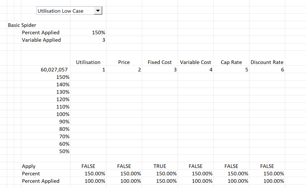
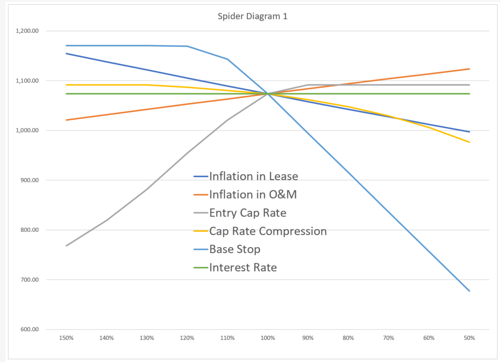
When explaining spider diagrams I begin with a basic case where every variable has the same potential range. This is a silly thing to do because not every variable has the same potential variation. The first diagram below illustrates a case where there is a simple range in the sensitivity.
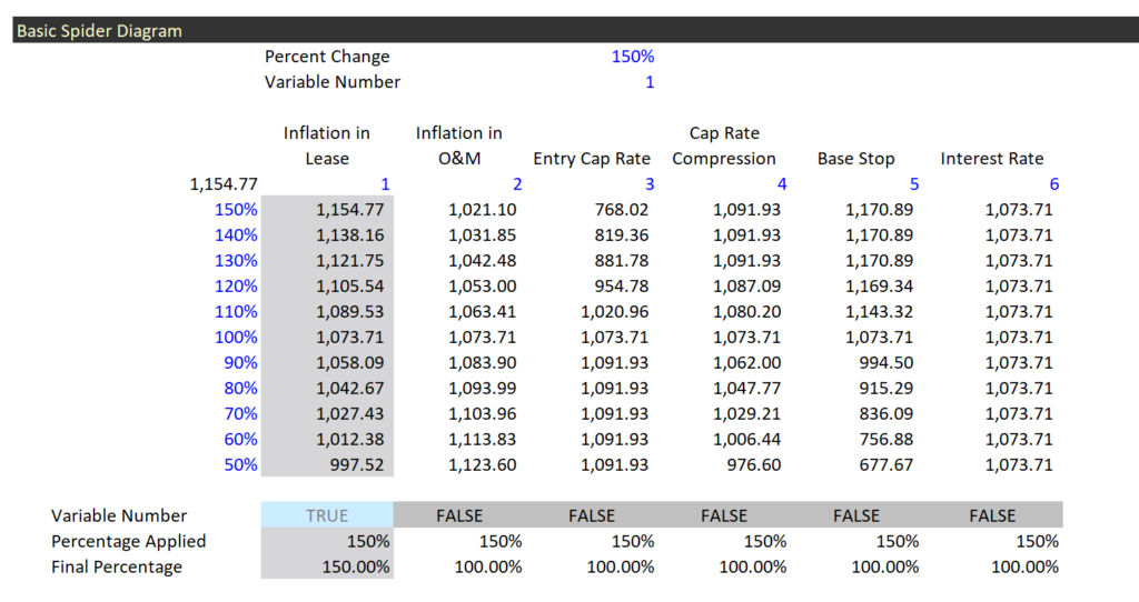
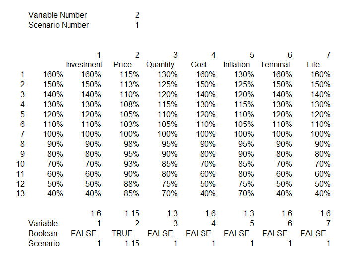
To make this kind of spider diagram you can set-up a two way data table. In this data table you can put in a code number for the row number variable and also a variable for the sensitivity factor. The set-up of this table is illustrated in the screenshot below. The key to this table is at the bottom. At the bottom I set-up an IF statement with a test that when the flag is TRUE, the sensitivity is applied. When the flag is false, the default of 100% is used. The final percentage at the bottom of the is applied in the financial model.
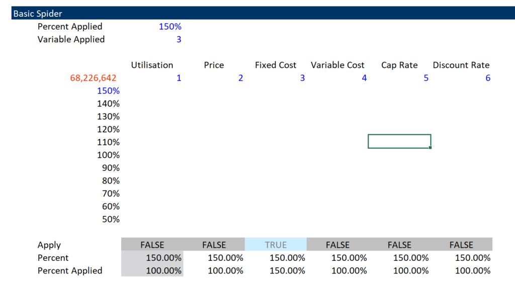
The screenshot below illustrates how you can apply the percentages to your model which is pretty obvious. You can just add a column and then multiply the percentage by the formula in the row or by the input variable. The key is that only one variable is implemented at a time. In the screenshot below, the formula shown takes the percentages from the bottom of the table shown in the screenshot above.
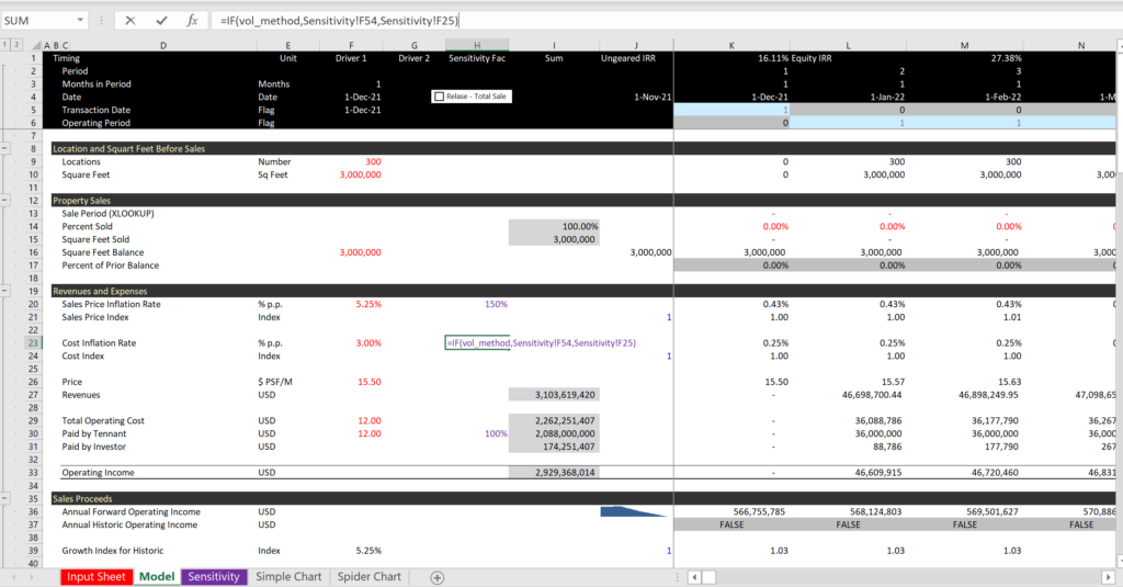
To make the table, I uses the SHIFT, ALT, –> and then hide the calculation line of the two way table. Then go to the graph and and use F11 or ALT, F1 to make a graph and change it to a line graph.

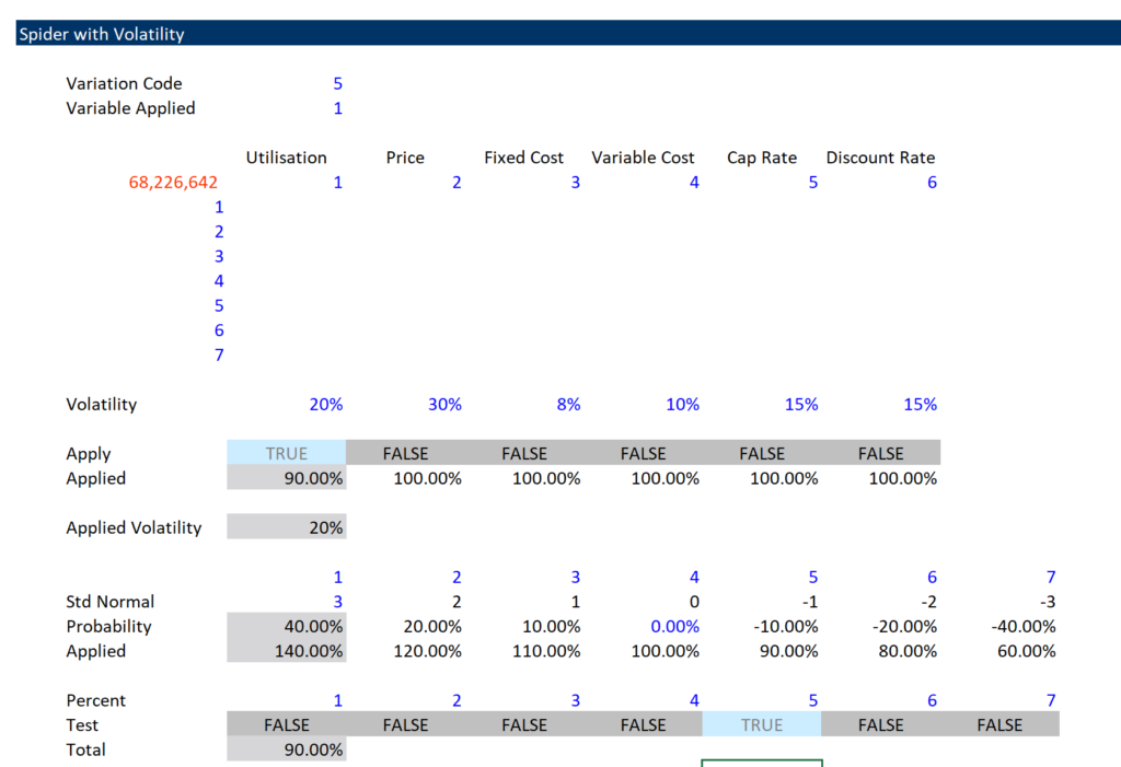
The graphs with applying the percentage change in a variable may look fancy but it is pretty useless. To make this method from a completely useless piece of crap into something that really focuses on the risk of a variable, you can add different volatility for each variable. You do not have to do this with mathematics, but you can use judgement and think about how high a variable can go or how low it can go. Adding volatility is illustrated in the screenshot below. In this case the range is different for different variables.
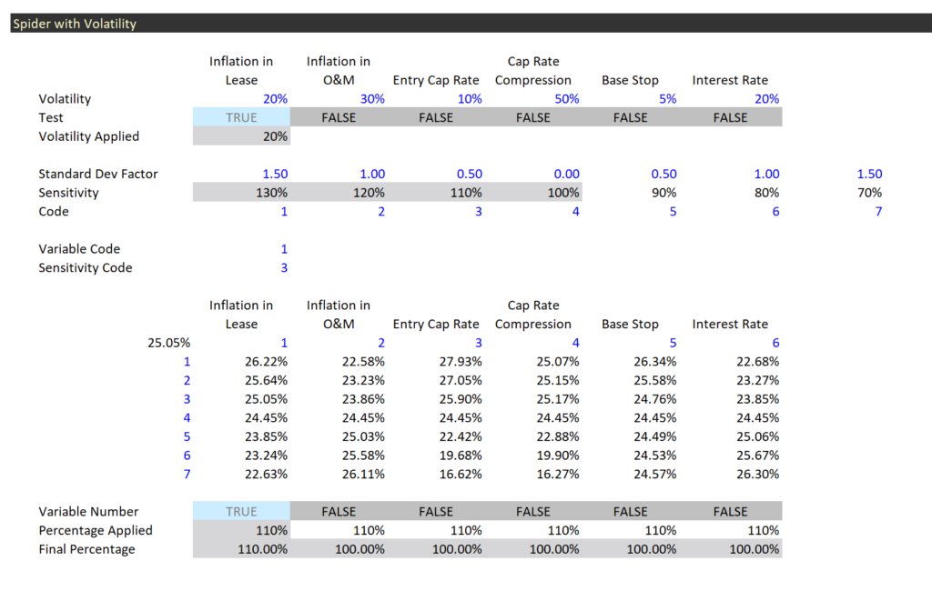
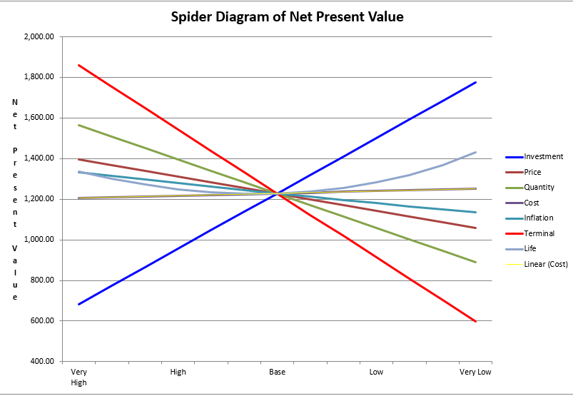
To create the spider diagram it may be silly to change all of the variables by the same percentage. Variables with a higher volatility should have a higher range. For example if you are varying the oil price you could examine the volatility of oil prices and then move from the largest to the smallest by some kind of standard deviation. The variation in the EPC cost may be much less if you have a fixed price contract and the range may be only a few percent above and below the expected level. You could even put a different downside and upside variation for a variable. To do this you can set-up a column of percentages for each variable as shown in the screenshot below.
The bottom of the table shown on the screenshot is the key to making the spider diagram work. You need to put the percentages in a column. This can be different for each variable. Then at the bottom of the column you can list variable number codes for each different variable. These codes correspond to the variable number at the top. The means when you change the variable number at the top it defines the only variable that will be the basis for the sensitivity. It is kind of like the normal old scenario number. But this time it turns the sensitivity on for one variable and off for all of the rest of the variables. Note in the example that the variable number is 2 and at the bottom, the only variable that has a true value is variable number 2 or the price variable. When the test is false, all of the sensitivities are set to 1.0 or the base case number. This just uses an IF statement with the form IF(Variable Number = Code,Index,1).
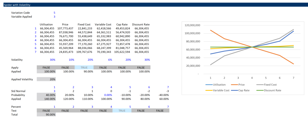
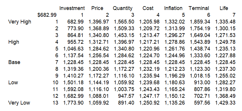
The screenshot below illustrates the creation of the data table used to create the diagram. The data table uses two code numbers. The second line and the second column can be hidden. On the column, the various sensitivity percentages are shown and this corresponds to the scenario variable. On the row the code numbers that change variables one by one are included. This turns on one variable at a time and drives the TRUE/FALSE thing. To make the data table work, you need to turn on and off the percentage factors. For example the investment is multiplied by 50%, 60% 70% …. 100% …. 130%, 140%. But this percent is only implemented when the defined row number is equal to 1.
Basic case with TRUE/FALSE Flag. Note the If statement at the bottom