The file below demonstrates how to make flexible graphs using the NA() method. This is a very simple way to make the x-scale flexible when you have a time series in the x-scale. To apply this method you substitute the #N/A for the date on the x-scale and you make sure that the x-scale is classified as a date axis. This can be created with a template that is saved in the file and is very good for presenting various statistical analyses. The file demonstrates how to gather data for the graphs with the INDEX, MATCH and INDIRECT function along with using TRUE/FALSE switches to limit the graph to selected items. It also includes use of the OFFSET function in order to change the number of items that appear on the x-axis. The bubble graphs are created using the macros that are included in the bubble file example above and in a video.
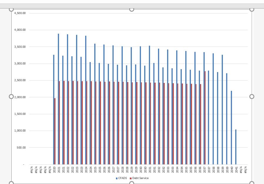
You could use an IF(CFADS,DATE,NA()) which would give you the DATE when the CFADS is positive and would give you the #NA when the CFADS is zero. An example of this kind of formula is shown in the excerpt below that is demonstrated on row 145. The CFADS and Debt Service graph that results is also shown from the ALT, F1. You can also see that sculpting has not been used and there is a funny repayment at the end. Further, you can see there is a grace period at the beginning.

The screenshot below illustrates what may happen after you select the area and make a graph. It is a big deal to format the x-axis row with SHIFT, CNTL 3 (CNTL, #). Then you can change the chart type to an area graph. If there are still NA’s, then you should right click on the x-axis and change the chart type to a date axis.

Using the NA trick with Annual Graphs
When you use the NA trick with annual data you will probably have to select the x-axis and then change the x-axis type to a date axis. A problem that can arise is that if there is a big or negative number that is part of the series and is not graphed, the y-axis will not adjust properly. To fix this, you can put the IF and the NA() into the series data as well as the x-axis. The screenshot below demonstrates this issue.
Dynamic graphs with #NA.xlsm
Spinner Box to Change the Scale on Graphs
The simple video below shows how to put a spinner box on a graph to allow you change the scale on a graph. All you do is to start recording a macro and then go to the graph and change the scale. After you record the macro you can enter the minimum scale somewhere in the file and name the range. Then just go back to your macro and replace the number you entered for the minimum amount with the range name using RANGE(“min”). Of course, you need to name the range.
Example with Hourly Merchant Prices
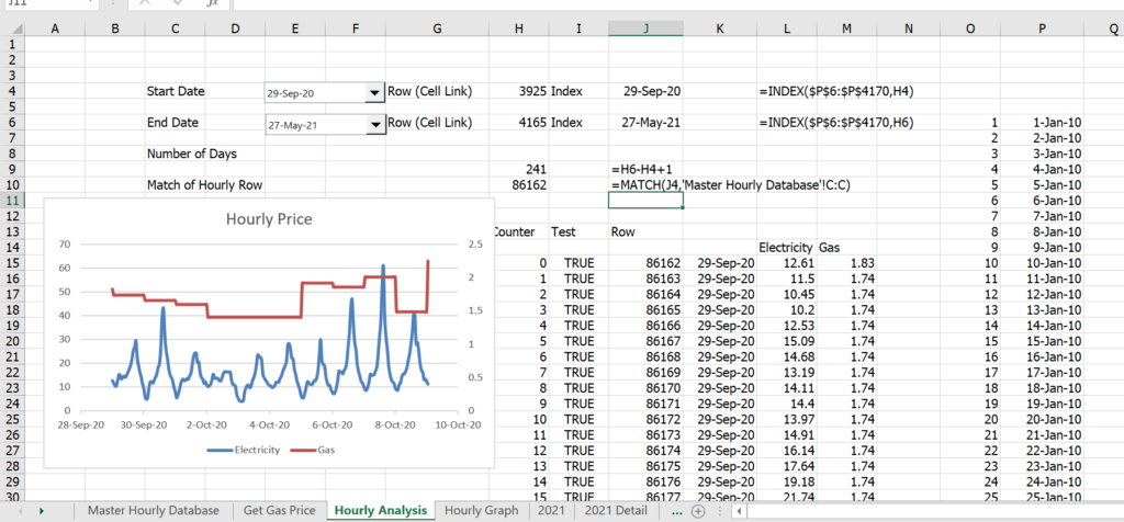
The output is put into a page named Natural Gas Prices. It is combined with the hourly price using LOOKUP and INDIRECT with the date. Once you have the natural gas price, you can make your hourly, monthly and annual analysis. For this I suggest you understand how things work and not worry too much about my simplistic equations. To graph a lot of the hourly data begin by making a date list (without hours) and then you can add a combo box so that you can use different start dates and end dates. This is shown in the screenshot below. Here are a few points about making the chart very flexible.
- Get the dates with the INDEX function on the list shown in column P.
- Count the number of rows from the start to the end so that you can use the NA() function and make the graph flexible.
- Make a counter with the maximum of rows you will present
- Use a TRUE/FALSE flag to limit the number of rows graphed
- Use the MATCH function with the start date to find the row in the detailed sheet
- Add the row counter to the initial match function by using the F4 function to lock the first value.
- Once you have the row, create a date function with NA() function to limit the graph
- Use the NA() on the gas and electric price

.
Example with Solar Panel Costs
.
Note the TRUE and FALSE Flag for defining the dates. Note that the data is also changed.
.

In this case I used an x-y graph because of staggered dates. The process works with and x-y graph as shown below.
.
.
