When using case studies to study risks and project finance structure, I think you can learn a lot from cases that were originally thought to be good business strategy or well structured and became dismal failures. Examples are Dabhol and Petrozuata. Similarly, a different way to learn project finance models is to see what not to do. This may be somewhat less boring than working through each of the detailed exercises.
Winson Churchill said something like — success is going from one failure to another without loss of enthusiasm: i.e. learn from mistakes and keep going. In this spirit, I think you can learn a lot more from looking at ways not to do thing rather than following the boring instructions that I have tried to put together in A-Z modelling. So, I have made videos and provided files on what not to do in making financial models. Looking at a badly structured model and fixing the model is demonstrated in the videos and the files below.
Case 1: Solar Project in India
I received an e-mail from somebody who wanted me to look at circular references in his model. I opened the model and there were many more problems than just circular references. I spent some time on the model and he did not send an e-mail thanking me. So I decided to use this model as a bad example. In the two videos below, I demonstrate what can go wrong with a model that is badly structured. There is no sources and uses; the inputs were terrible; the cash flow was not set up …. A screenshot of the model with circular references and something that should represent a sources and uses statement.
The first video below describes the model and explains many things that are wrong with the model. This may be a good way to learn what not to do in the models.
.
.
The second video demonstrates what I did to fix the model including re-structuring the model; including a sources and uses of funds statement and using a UDF function to fix the circular reference.
.
.
.
Case 2: U.S. Wind Model
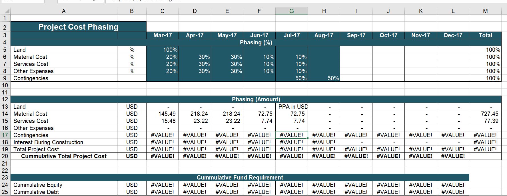
The second case demonstrates problems with using fancy project finance terms (like b/f instead of opening balance) and making beautiful colouring schemes. I go crazy when I see people who think the colouring of a sheet is more important than the analysis. Look at the page below. It has beautiful colours, but the number of days in the month is wrong.
The model in fact shows how not to learn. The person making this model spent a lot of time looking at other really big models with long equations and beautiful colours. This is a B.S. way to learn. You should first spend some time on the fundamentals of structuring a model with dates, computing EBITDA and then putting in a summary sources and uses of funds. You can do this by looking at a couple of videos and you can even use the generic macros program to colour your sheets.

Case 3: Hydrogen Fuel for Garbage Trucks in Australia
My friend Mario in Australia is wonderful. He thinks way outside of the box; he really wants to improve the world; he is incredibly creative. He gives me modelling assignments and he is now interested in using hydrogen for electricity (we have never made any money at any of this). Instead of always having an excuse why things cannot be done, Mario will try anything to solve a problem. In the example below, we worked on a little hydrogen analysis together as Mario told me the benefits of hydrogen relative to vehicles with electric batteries. We tried to compute the unit of levelised cost of operating a fleet of garbage trucks with hydrogen compared to diesel and we made a little model that illustrates the drivers. We made a model that illustrated the kinds of things you have to include in a model and then we attempted to answer the crucial question of whether hydrogen could be economic for a fleet of garbage trucks (I am not sure how they are called in Australia).
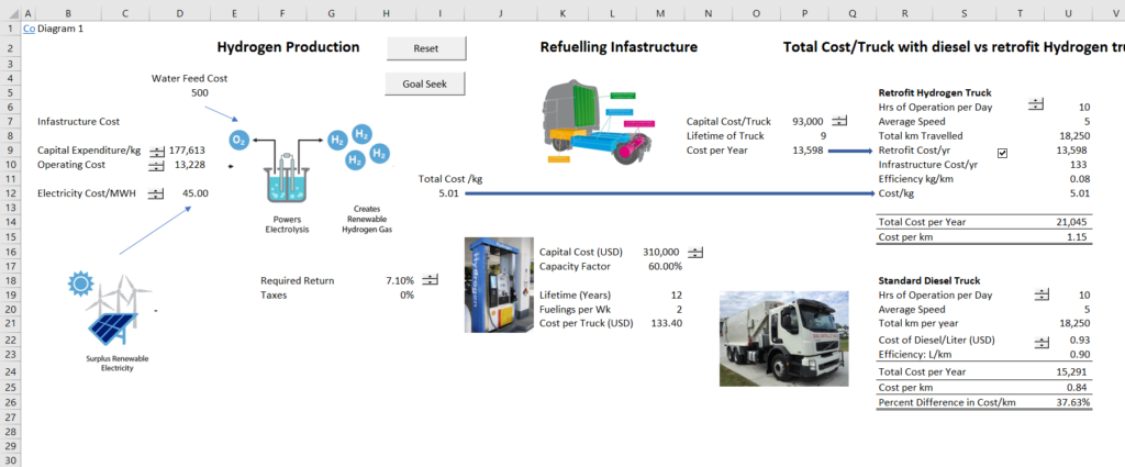
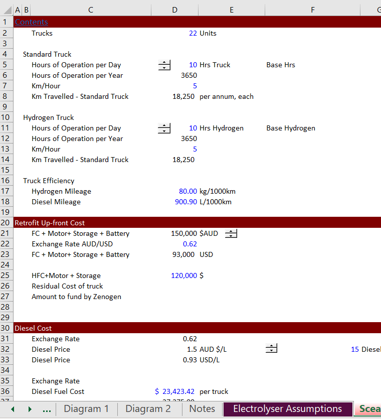
We separated the assumptions for the various parts of the analysis and included the assumptions in separate sheets as illustrated in the two screenshots below. We put in key variables about how much the electrolizer costs and the characteristics of the trucks that will use the hydrogen.
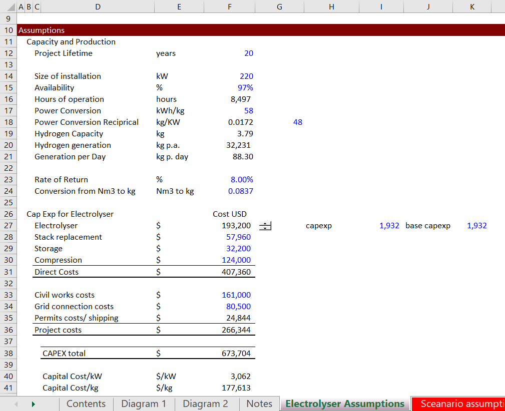
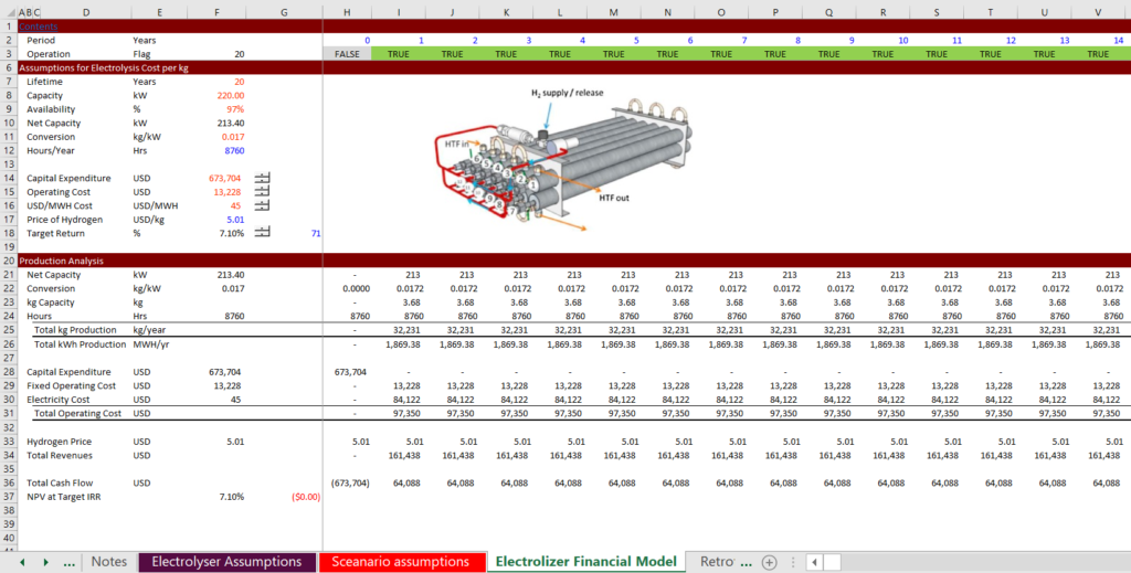
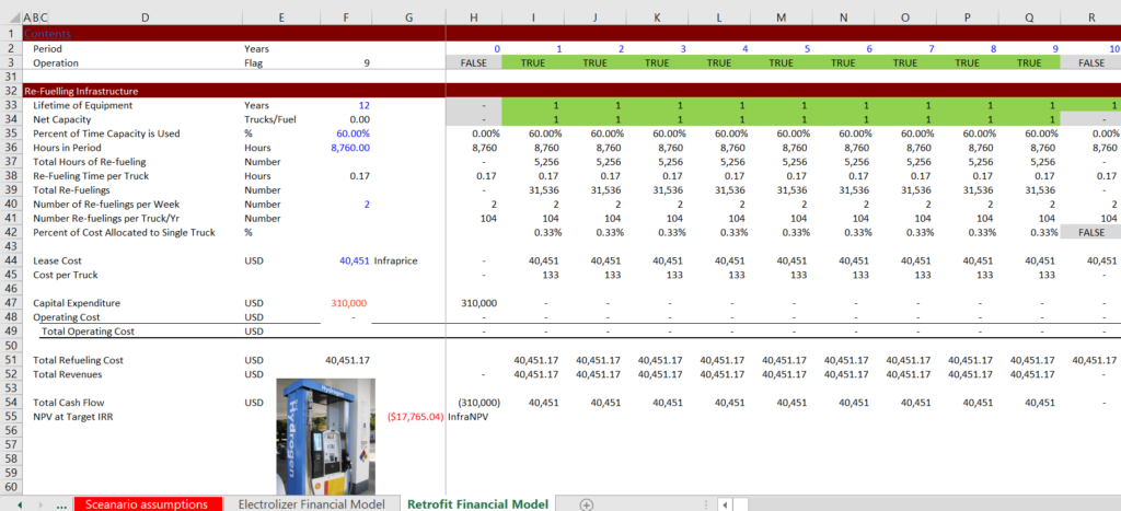
We made a little project finance model of the electrolyser with the capital expenditures that are required and the amount of hydrogen that is produced. Notice that we put in a flag at the top to evaluate different project lives and we put the quantity of hydrogen at the top. An illustration of our very simple project finance model is illustrated on the two screenshots below. The first screenshot is for levelizing the electrolizer cost and the second screenshot is for levelizing the cost of the required filling stations.
Replacement “Project Finance” Model that is a Piece of Shit
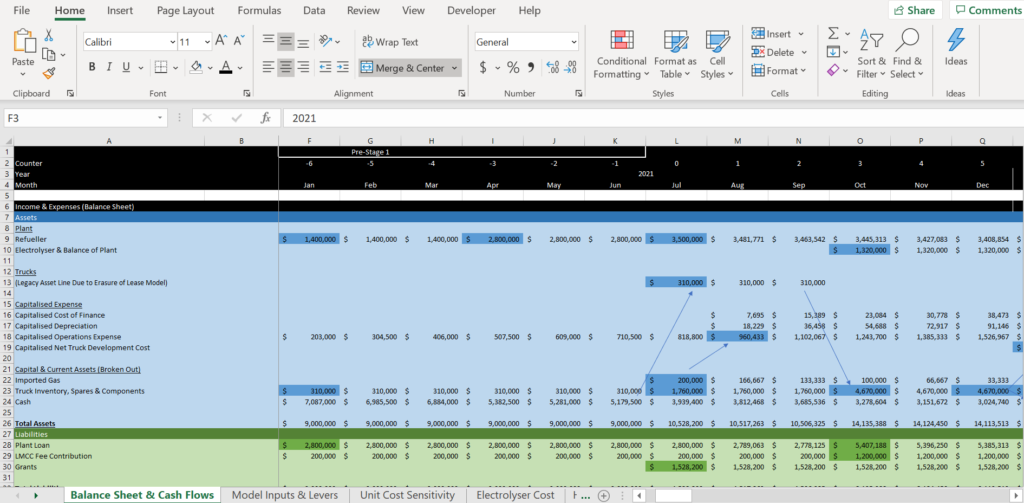
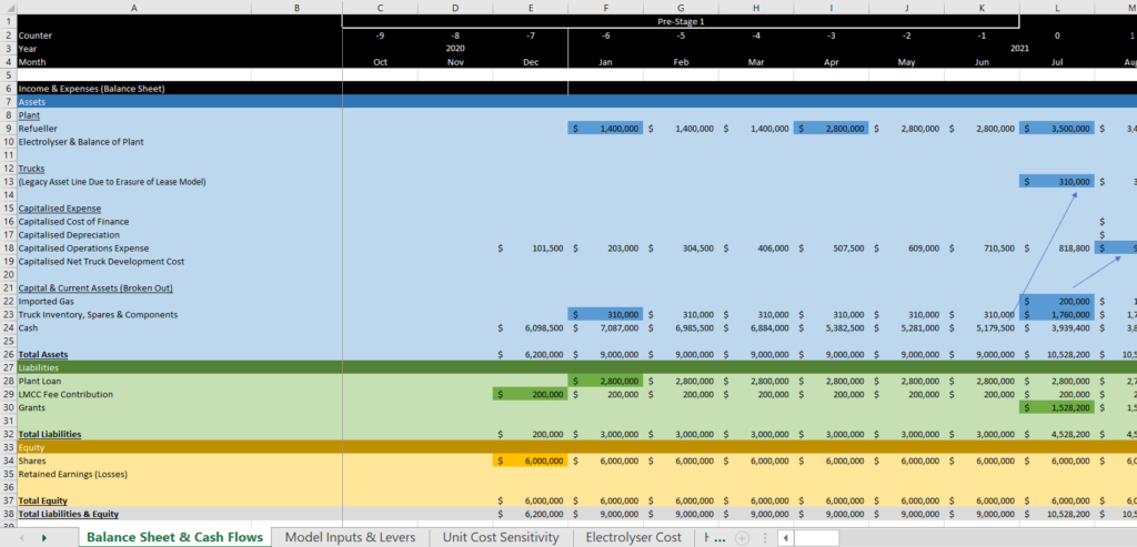
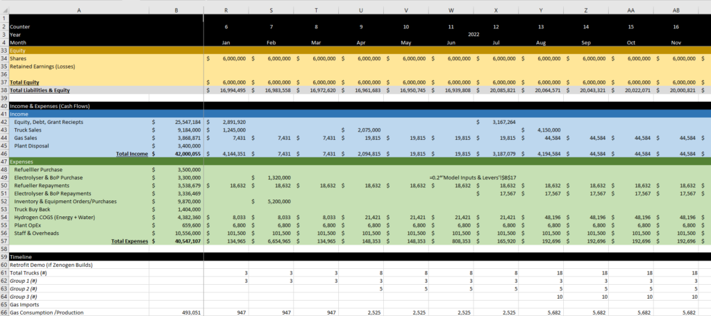
Mario went to the city council and asked for the City to replace its garbage trucks with trucks that could run on hydrogen. He worked with a young man who was convinced he was a good modeler. Mario told me that the model had a different style and he called me back and asked me to make a couple of changes to the model. Mario was wrong. The model he gave me was total shit as illustrated in the screenshot below. Notice on the first screen the useless colours, the fact that there is no columns at the left, that the whole thing starts with a balance sheet; that there are blank formulas; that there is no automated time line; that there are sudden dates at the top; that you have no idea what the drivers are. There is no summary page with the key drivers. These are not differences in style. These are high modelling crimes.
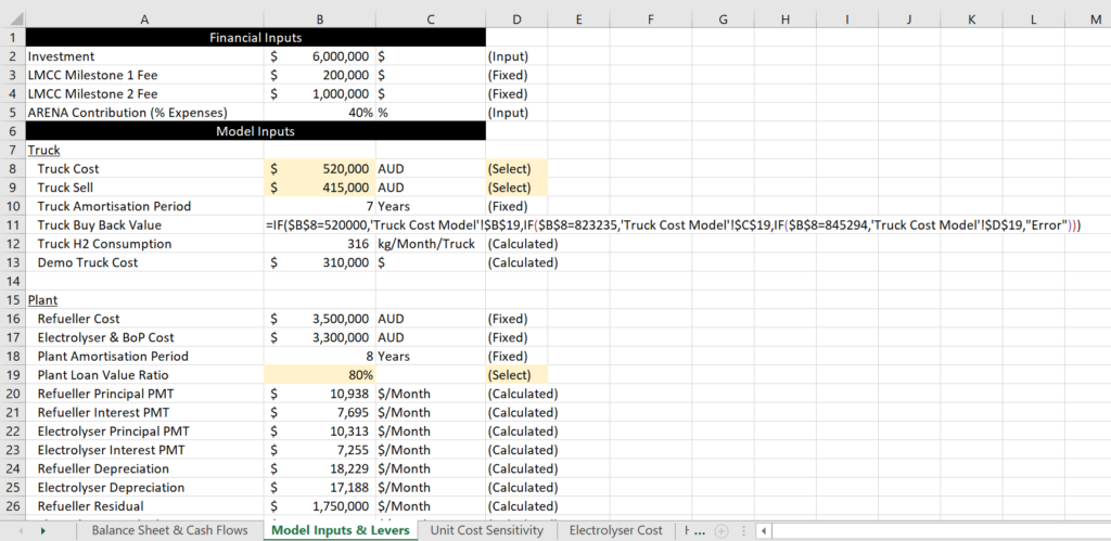
The supposed Input Sheet is shown in the screenshot below. Note that the inputs are not defined at the top. Incredibly there are inputs mixed in the sheet. Then there is a fixed formula with references to other sheets. The finance inputs are mixed together with the operating inputs. This is just from opening the sheet. Most important the input sheet does not start with how the project works. In the screenshot I show a really long equation that suddenly appears in the input sheet with idiotic references to another sheet, fixed values and nested IF’s. The sheet also has LMCC labels that are meaningless to just about any lay person like me.
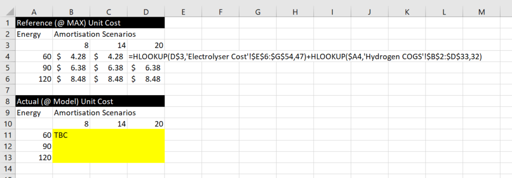
Another sheet in the file contained something called a “Unit Cost Sensitivity”. This included a horrible example of using HLOOKUP — another crime. This should be labeled effectively and completed with a simple little macro. The Hlookup uses row 32 and row 47 which are fixed.
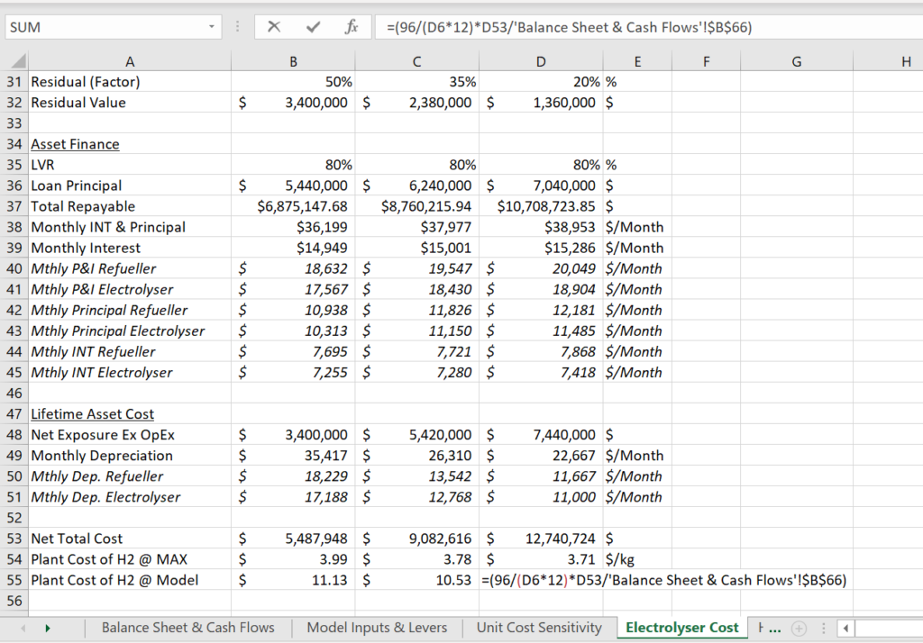
On the next sheet of the shitty model, there are some more inputs (that are not labeled). The scenarios are not labeled. There is a major crime in the cell that I have marked where a fixed input is combined with data from another sheet.
The final screenshot returns to the first page with the balance sheet and income statement. Remarkably there is no cash flow statement and even more concerning, there is no layout for the amount of hydrogen produced; the amount of electricity used to produce the hydrogen; no timing flag for replacing trucks; no layout of the number of trucks; no cost of the pumping …
The final complaint I have is use of the Merge thing at the top. When somebody uses merge it is probably a good sign that their models are shit.
