On this page I walk through how to create a football field diagram. A football field graph is a pretty silly name used to present alternative valuation techniques with different ranges for M&A analysis. For example, the range in valuation from low and high comparable P/E ratio’s is compared with the range in value from a DCF method with different WACC assumptions. While the name is irritating, the idea of presenting different valuation approaches is pretty good because a football field diagram shows that different valuation techniques can be used and that it is naive to believe a single valuation amount is reasonable. Making a basic football field graph is can be accomplished with the bar chart selection in excel. Making the bar chart with the range of values is pretty simple. But the problem comes when you put labels on the valuation bars in the chart from different methods. The step by step description and the video below demonstrate how you can construct such a flexible football field diagram that includes the valuation amounts as labels on the graphs. Putting labels on the football field involves adding a separate series to make spaces and it can be painful. The good news is that no macros are necessary.
Summary of Tricks
The tricks to make this work is to are to add an increment between the high and the low. The increment is what is graphed and the high an low are used to create the data labels. To make a football field diagram use the following steps.
Step 1: Create Increment
In this example I start with a high and a low for an assumed M&A transaction. The example is attached to the button below.
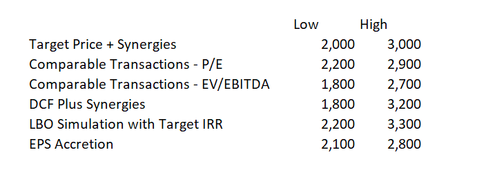
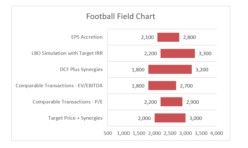
The data below is an illustrative starting point
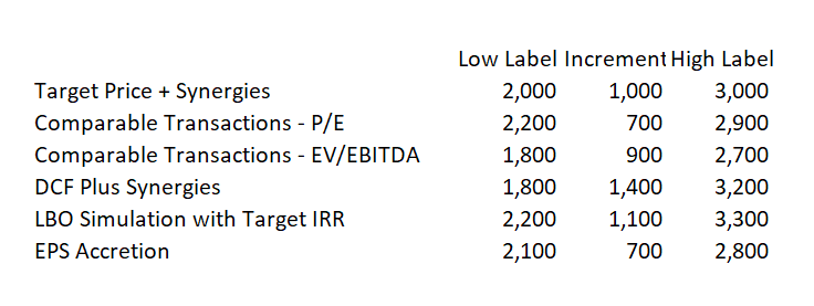
Now, simply repeat the data and put the increment between the high and the low in a separate table as shown below. Note that the low and the high are now just for the labels and the increment is the real item that is graphed.
Step 2: Insert a Stacked Bar Graph Using Alt F1
After you create the table, select the data and press Alt F1. You may have to right click and change the row and column. Note that the little red thing in the middle is what will be graphed
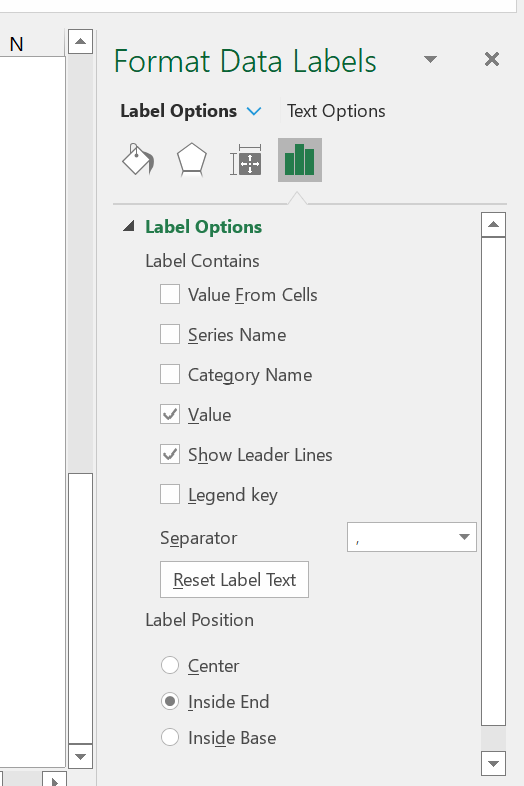
Step 3: Add Labels
Select the blue area and add data labels. Then you can format the data labels so that the are close to the red bar.
Step 4: Do the Same thing with the High End Data Labels
Do the same thing but you can use a different way to format the data labels to get them close to the middle bar
Step 5: No Fill the Data Label Bars
Click on the blue and green series. Format the data series and then go to the no-fill. Click the no-fill for both the low and the high label
Step 6: Format the Graph – Thick Bars, Change the Scale, Remove the Legend
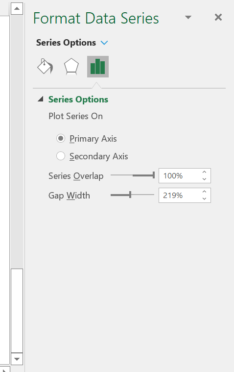
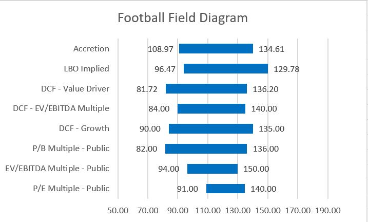
The graph below shows how you can format the final graph. To make the bars wider, go to the series and make the graph width less wide.
You can also change the grid lines
Prior Explanation
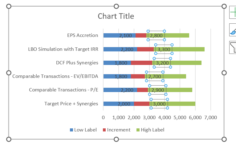
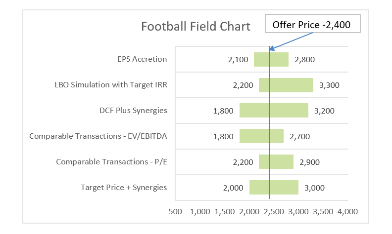
The file that you can download from clicking on the button below walks through the steps for creating a football field diagram from the assumed ranges in values from different methods shown in the screenshot below. The screenshot shows above illustrates the end of the process that includes the bars and the tricky to implement labels. Subsequent screenshots on this page demonstrate how to get from the values in a table of value ranges to the football field diagram with data labels. As usual, I have also included a video describing the process.
.
Excel File with Step by Step Description of How to Create Football Field Diagram and Include Labels
.
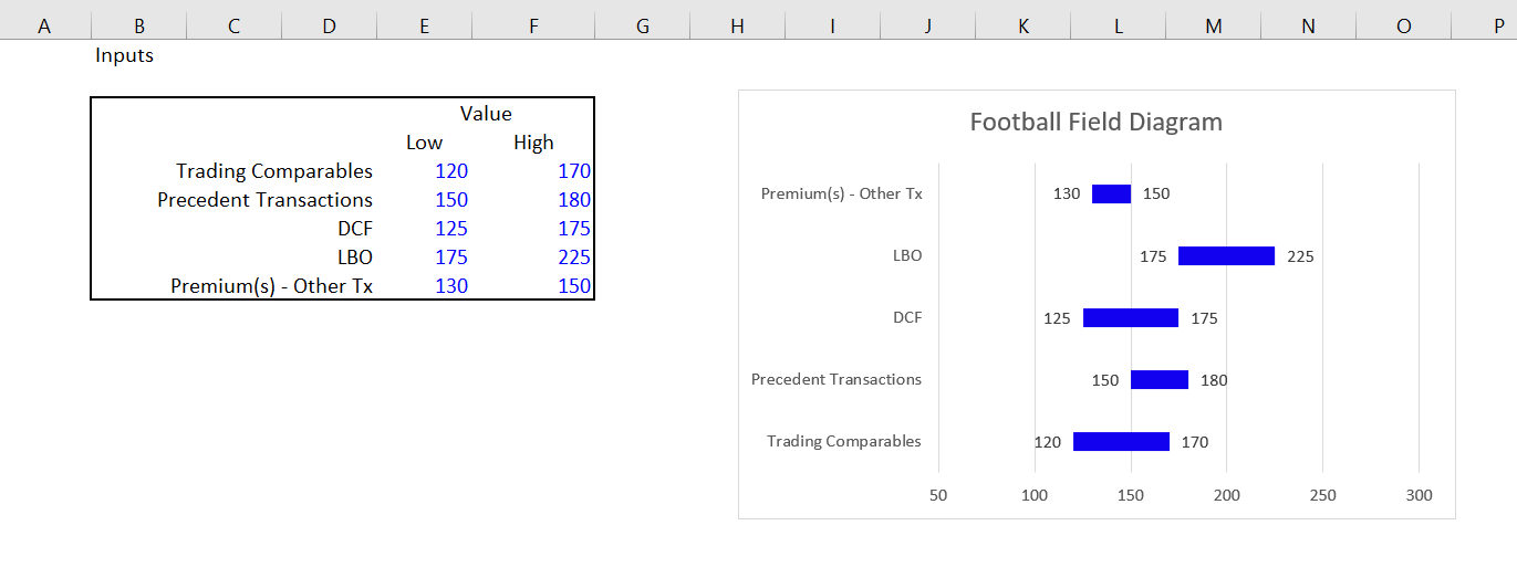
Once you have the data with the different valuation techniques and the ranges for each technique, the key step is create a table with the low range, the increment and the high range. The low range is for the data label that goes on the left and the high range is for the data label that goes on the right. The big deal is to create the increment that is calculated as the difference between the high case and the low case. The screen shot below demonstrates how to set up this key part of the process of making a little table.

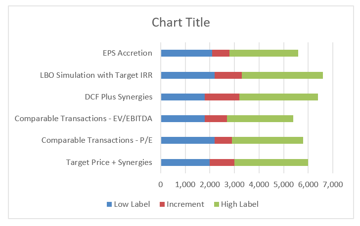
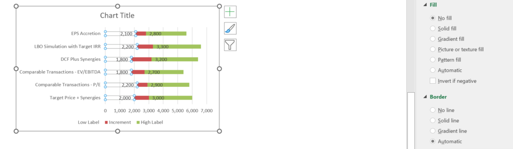
Once you have the table, the next step is to make a graph from the three columns that will not look very good but will be the outline and provide the basis for the final graph. In the example illustrated on the screenshot below, I have selected the second table from the above screenshot and pressed ALT, F1 to insert the graph on the same page. Then I have changed the chart type and made it a bar chart. In the bar chart I select the second option that is a stacked bar. With the stacked bar, that has the low range, the increment and the high range.

The graph in the screenshot above does not look too good. But don’t worry. Now you can start cleaning up the graph with the bar chart and putting in the data labels. The first thing to do is just to make the bars at the left and the right into no fill bars. To make the right bars into no fill, you select the data series and then clicking on the no fill option. The result is shown in the screenshot below where there is now the increment and the high range shown. The “No Fill” option is illustrated on the right hand side of the screenshot below.

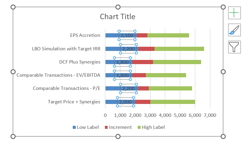
You should also click on the upper range and use the no-fill option. Once you have removed the fill and created data labels, click on the data labels and then the labels will appear out of place. To put them in the correct place, format the data labels and then choose the Inside End option. After you select the “Inside End” as shown on the right hand side of the screenshot below, the data labels will look pretty good as illustrated on the screenshot.
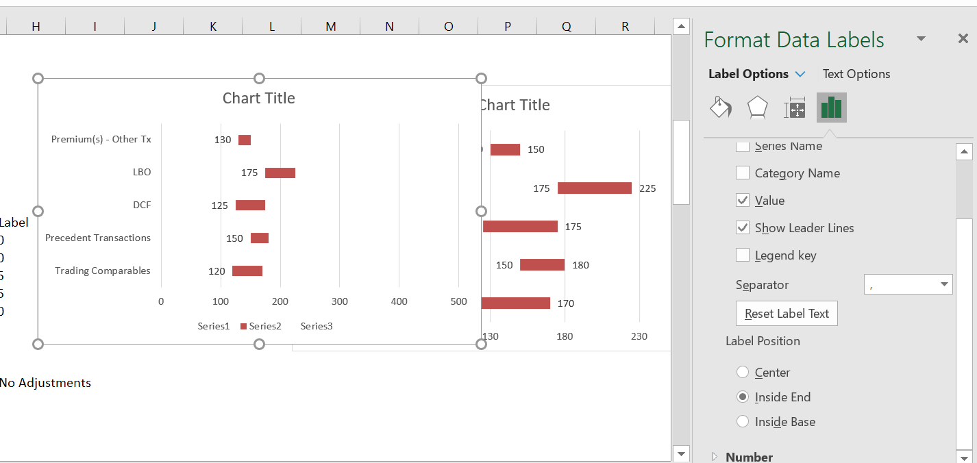
The screenshot below shows how to adjust the data label for the high end of the data range. Here you should use the inside base when you format the data label as shown on the screenshot below.

Once you have created the data labels and aligned them, you can just change the x-axis to make the range look reasonable. Of course delete the series stuff at the bottom as well.

You need to change some colours and add some labels. The trickiest part is to get the labels You have to do this one bar by one bar and click on each label.