This pages demonstrates some corporate modelling ideas that you can learn from review of an actual model that has some problems. If you want to see some corporate modelling ideas, you can review the model and some of my comments below. You can then think of some of your ideas that would improve the model. To work on the case I suggest that you download the original model before I made any revisions and think about it yourself (you may think the model is really good because it has a lot of pages). I use this little case study as part of a pre-course exercises that some people may want to think about before taking a course. To obtain some background you can look at the associated videos and explanations; you can go to some of the links and compare the model to models that I think have a better structure; and, you can try to evaluate the model and then make some fixes to it. Some of the concepts you can learn from this exercise include: use of ROIC to evaluate a model; good structuring of a model and presenting assumptions in a transparent manner; using an historic switch in modelling; presenting history beside forecast data in a corporate model; computing and evaluating depreciation; creating a flexible free cash flow analysis; construction of valuation with reasonable terminal value assumptions; and, generating effective scenario and sensitivity analysis.
I have developed various different webpages, files and videos that walk through how to create corporate models from A-Z and begin with a blank sheet. Another way to learn how to build models is to see what not to do. I sometimes think reviewing bad models and seeing the mistakes is perhaps better than beginning with a blank workbook. The videos and associated files below walk through an explanation of what not to do in corporate models and how to repair mechanical and logical errors. This also may be somewhat less boring than working through each of the detailed exercises.
Opening the Model and Model Structure
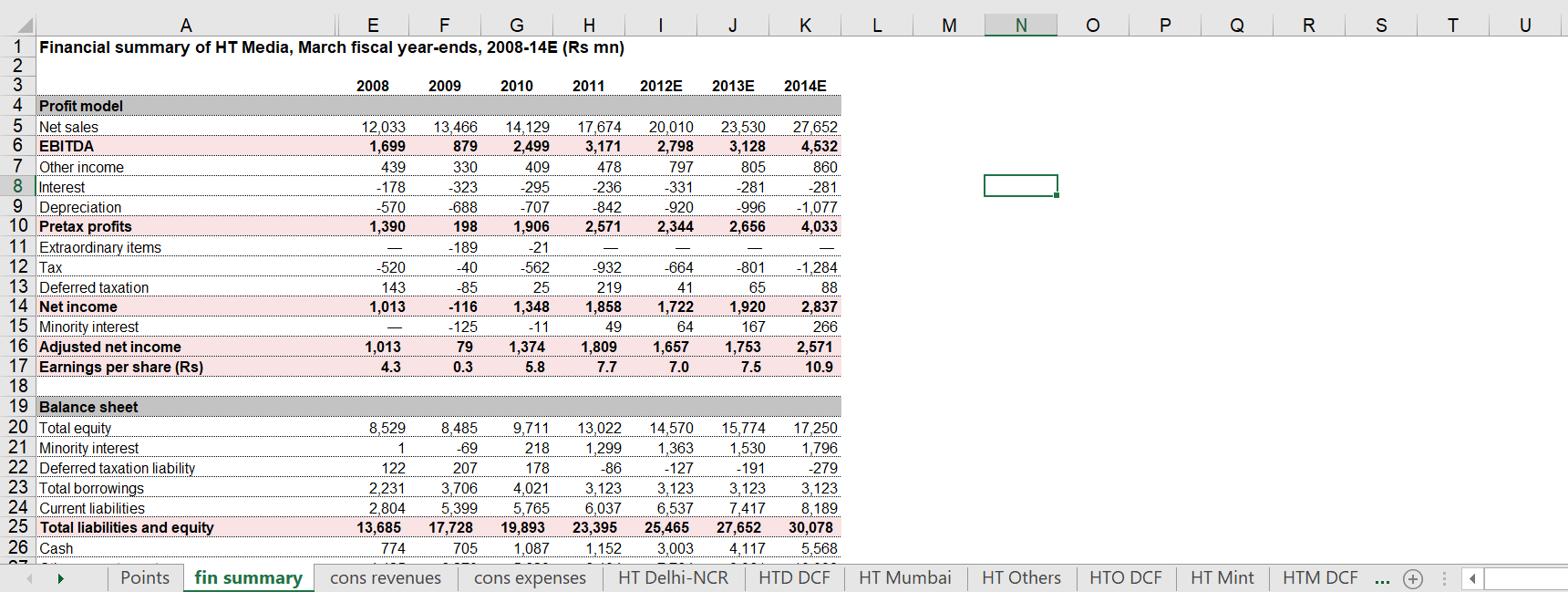
The model may look pretty sophisticated when you open it (one of the pages is illustrated on the screenshot below). But the model does not follow a natural flow beginning with historic financials, moving to assumptions and then to operating cash flow (i.e. it is not well structured); it does not present history compared to forecast in an effective manner; and, it contains important logical and mechanical mistakes. All of the detail in the model and the work in collecting the data is really a lot of B.S from a valuation perspective. In the screenshot from the model shown below, history is presented next to the forecast which is always a nice thing to do. But the way the model should really work is that you should put the historic financial statements at the top and then work downwards through assumptions, EBITDA, free cash flow, financing and finally to financial statements that have both history and forecast. You can see how to do this by watching video on the creating actual corporate models and using the historic switch. In the model example here, when you work through the different sheets, you see things that are very difficult to follow and no natural and logical structuring where the historic financials lead to the assumptions, revenues, expenses, capital expenditures, working capital, debt and then historic and projected financials. With so many sheets in the attached file, presenting a nice summary with graphs of the history and forecast is impossible. The thing you get when you open the model is illustrated below. Some of the exercises that you can do to clean up the file are shown in the video section below.
Assessing Return on Invested Capital for History and Forecast
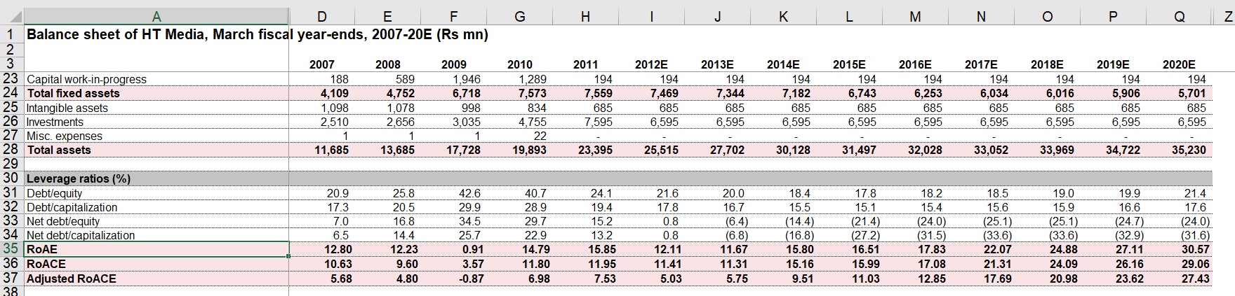
I have suggested many times that review of historic and projected return on invested capital is a good way to assess a model — not perfect, but better than other ratios such as return on equity or EBITDA margin. I also think a lot about problems with measuring the return on invested capital for many types of businesses and when things like write-offs or mergers occur. For model assessment, the return on invested capital is a better gauge of the reasonableness of assumptions than other measures of return like return on equity that is distorted by changes in the capital structure and EBITDA/revenues which does no tell you anything about the investment necessary to earn EBITDA. The screenshot below this paragraph illustrates where you can find the returns in the HT Media model. For some reason, you can find ratios in the balance sheet page (I have no idea why it would be in this page). You can then find the return on capital employed which is essentially another name for the return on invested capital. Look at line 36 in the screenshot below and notice that the model assumes a dramatic increase in the return. Note that the return in the first couple of years is around 11.5%. But then the return increases to 30%. What a lot of B.S. This single statistic should completely invalidate the model.
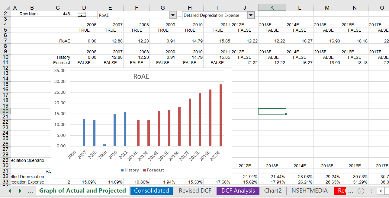
I have added a sheet to the model that you can find in the second file available for download above. This sheet begins with a row number so that you can make a graph of any item on a page (it is a little difficult to make a graph of multiple items and that is one reason I think it is good to keep most of the model on a single page, but that is only my opinion). This sheet in the repaired model includes a summary that graphs the history and the forecast for various different items that work with a spinner box or a drop down box. Once you have defined a row number you can can make a drop-down graph where you can graph any of the items. The screenshot below illustrates how a summary page with a graph could work. The selected graph shows the history and the forecast for the Return on Average common equity. You can see how to make these graphs in the link associated with this sentence. It is easy to put the history and forecast in different colours by using TRUE and FALSE switches that should be completely flexible in your model so that you can add more historic periods without completely changing the model.
Depreciation Expense
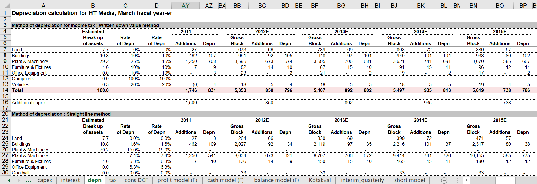
The depreciation section in the model looks really fancy with the gross block, the additions and the depreciation for each year as shown in the screenshot below. It looks like the depreciation section of an annual report. I sometimes go a little crazy about modelling depreciation expense in a model and argue that using the historic depreciation expense to net plant may result in some errors. You can see some of my depreciation comments in the associated link. If projected growth is different from historic growth, then computing and applying the depreciation expense divided by net plant will be incorrect. For example if growth is slowing, then the depreciation rate on net plant will increase and using a depreciation rate that is too low will understate depreciation. Depending on which valuation model is used, the value may be increased because taxes are understated; or the value may be overstated because income is also overstated. But if depreciation with a constant net plant rate is bad, it is even worse to compute the depreciation on the basis of gross plant and to ignore retirements. This is one of the mechanical problems with the model we are discussing where the projection does not account for any retirements. This means the depreciation is overstated by a wide margin. The correct way to model gross depreciation in my opinion is to use the SOLVER tool to derive the base retirements and growth rate in retirements from accumulated depreciation balances and the depreciation rate as shown in the link. The video and the discussion below illustrate correct this mechanical mistake and illustrate the effects of the error.
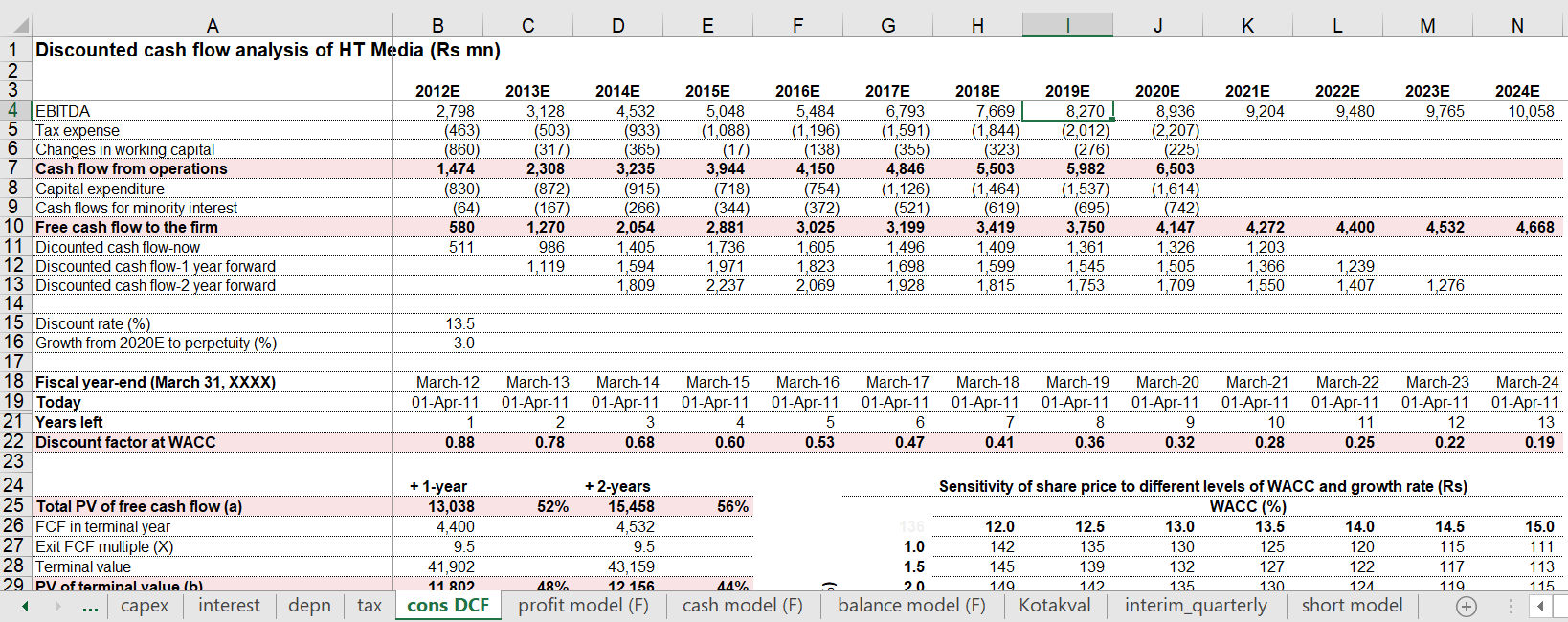
DCF Analysis in the Model
When you finally find the sheet that contains the valuation, named “cons DCF” the model again seems really sophisticated. If you are looking for this sheet you can see it in the screenshot below. But there is a whole bunch of crap in the fancy DCF calculations. For example, the discounting does not reflect a 1/2 year assumption; there is no normalisation of terminal cash flow; there is only one terminal value method; there is no flexibility to make the model use different explicit periods; and, the enterprise to equity value does not work through the balance sheet. The second video below discusses ways in which you can set-up the DCF analysis to be flexible and theoretically correct. There are a whole lot of careful normailsation adjustments to make like evaluating the stable capital expenditures to depreciation and evaluating working capital using the working capital to EBITDA ratio. This is discussed in the associated link. You can peek at the model results in the screenshot below and see that even with low growth of 1%, the share price in 2012 was supposed to range from 111 to 142 depending on the required return.
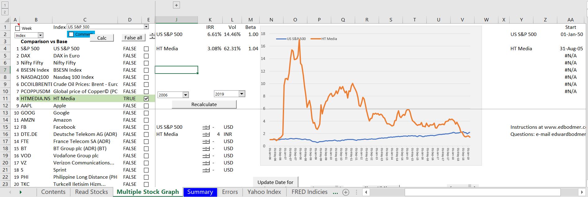
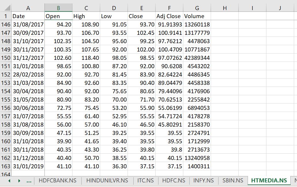
Before reviewing a couple some of the valuation methods in more detail, I evaluate the actual stock price of HT Media. The first screenshot shows the stock price of HT Media compared to the US S&P 500 (adjusted for dividends and currency differences). You can see that the actual stock price has continued to decline and was not worth the values projected in the model. If you want to make some stock price analysis and gather data with just about any stock or economic time series, you can go to the associated link. The model suggest a current stock value of more than 130. This means the future stock price woul have implicitly had to increase a lot from 130. The screenshot below the graph with a table of stock prices (that is collected in the comprehensive stock price file) shows that in 2018 the price was hovering around 40.
Adjustments to the DCF Analysis in the Model
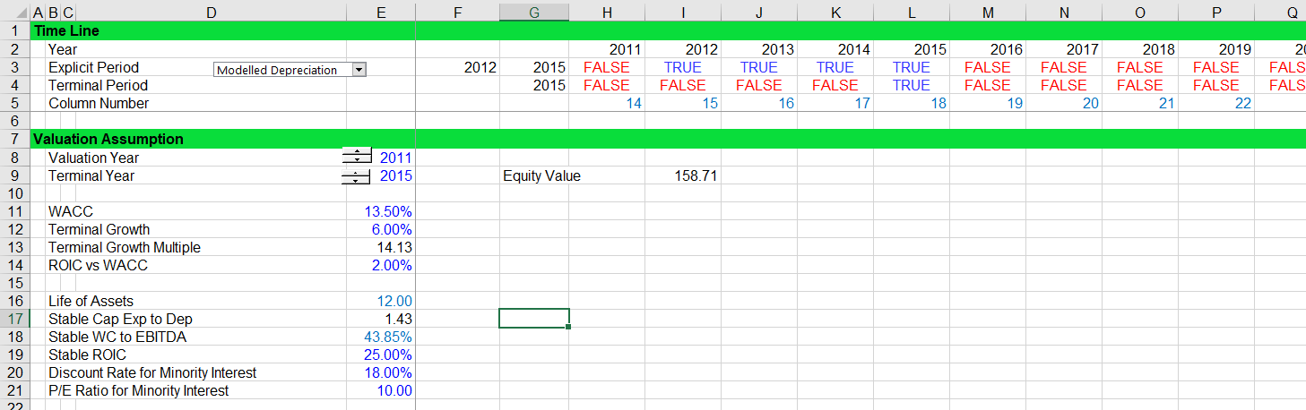
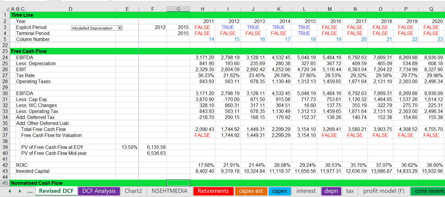
Some of the repairs that I made to the DCF analysis that are included in the revised model (the second file at the top of the page) are shown in the screenshots below. The first screenshot illustrates how valuation assumptions could be set-up that include assumptions for stable ratios associated with normalised cash flow in the terminal period. The screenshot also shows how you can set-up TRUE and FALSE switches (or 1’s and 0’s) to make the valuation flexible. In the screenshot below there is no fix to the mechanical problems with the depreciation expense. In the scenario associated with these assumptions and without an adjustment to the depreciation expense, the measured value is 158 per share.
The second and third screenshots below continue to show the cash flow calculation that are used to derive the value in a corrected framework. The first page demonstrates the adjustments that should be included in the free cash flow calculation including deferred taxes and changes in other liabilities. It is important that changes in the deferred tax be included in the free cash flow and that the accumulated deferred tax should not be in the bridge between enterprise value and equity value. This is discussed on the cash flow normalisation page. The free cash in line 37 is adjusted with TRUE and false calculations for the flexible discounting process. This assures that the discounting will start and end at the correct times. You can then you a regular old NPV calculation as long as you multiply the result by (1+WACC)^.5.
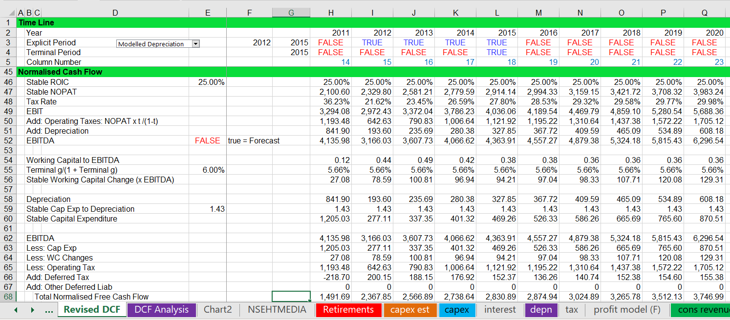
The screenshot below illustrates the computation of normalised cash flow that you may make in a valuation analysis. I begin with a stable ROIC because there may be various reasons that the final year may be high or low because of things like a cyclical commodity business. If the assets are getting old, new assets may be required and these may not be measured with the capital expenditure adjustment. This can be measured by lowering the ROIC to a number associated with the IRR that can be earned on new assets or adjusting the capital expenditures. Other adjustments are made for stable working capital where you take out the working capital changes from short-term growth and replace the working capital changes associated with the stable terminal growth. The formula for stable working capital is the following: EBITDA x WC/EBITDA * terminal growth/(1+terminal growth). This formula is discussed in the working capital and stable cash flow page. Other adjustments are associated with capital expenditures and deferred taxes. Capital expenditures for the normalised cash flow are computed from the stable capital expenditure to depreciation ratio. This is explained in stable cash flow from capital expenditures page. The end of the screenshot show the normalised cash flow using the various adjustments.
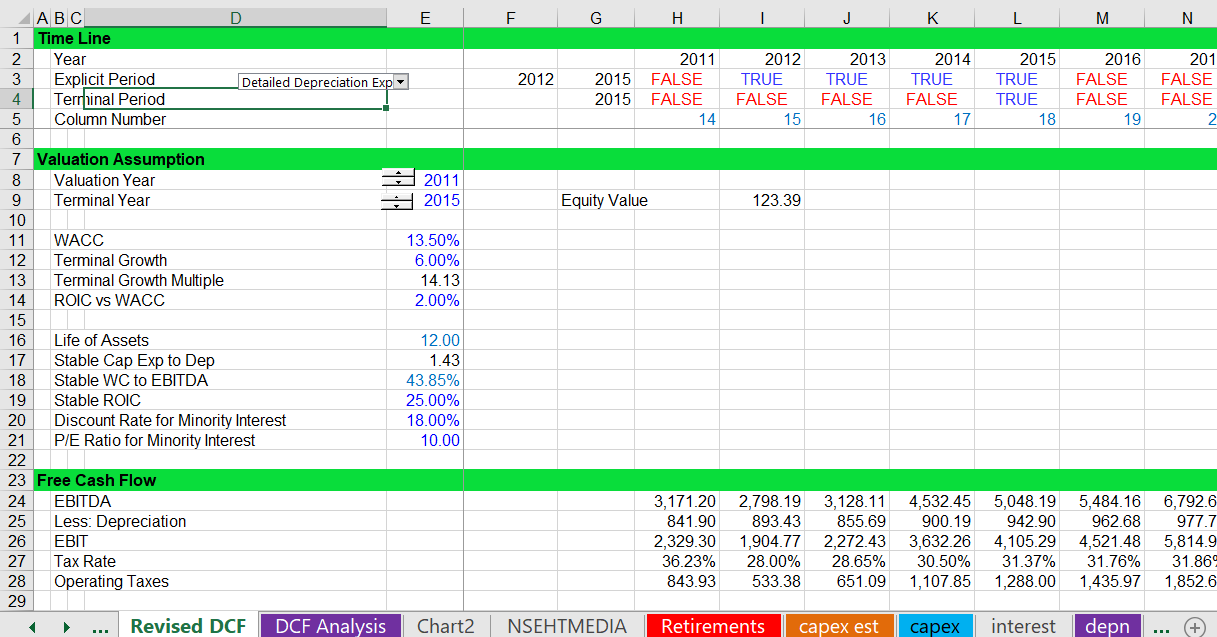
Once the valuation is established, the effect of detailed depreciation with retirements can be quantified. The valuations based on cash flow will have too much depreciation is not included. This means the taxes will be understated and the value will be too high. In the screenshot below, the retirements are included and the valuation is less. In the screenshot, the valuation is 123.4. This compares with the above screenshot where the value was 158. The effect of overstating the depreciation also affects the normalisation adjustment.
Videos that Illustrate Problems with the Model and the Process of Repairing the Model
I made the video a while ago with my old website that was taken away from you and me. In the video I begin by looking over the spreadsheets and just making a table of contents. You can try this yourself by going to the generic macros page. Open the generic macros along with the model file and press CNTL ALT C to make a table of contents and better colouring. The video describes some classic issues about being difficult to understand and work through; the ROIC in the model (well calculated) is quite high relative to history; the model does not have a historic switch; depreciation on the model is computed on gross assets without retirements;
Then you can go to a page that has historic and projected data — you can go to the consolidated data page. Make a new row at the top and add an historic switch. Also insert a couple of columns so you can document the data. Once you have made the historic and projected data on the same page with the historic switch, you can look at some of the formulas to make sure they are consistent. Also, try to make a nice colour and layout using the generic macro program. The video then works through how to make a historic and forecast graph so you can see all of the data. You can use the INDEX function to select any data on a page. The best way to do this is to not worry about fixing cells and instead to use the entire column. Other issues include finding stock prices and evaluating depreciation expense and capital expenditures.
.
The third video addresses different ways to improve valuation formulas and the DCF analysis. It discusses how to download stock price data and also how to make a DCF analysis flexible. I would be really impressed if you could make it through all of the videos.
.