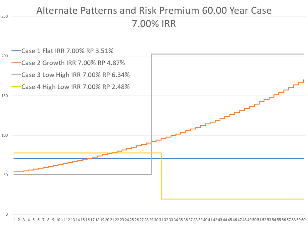
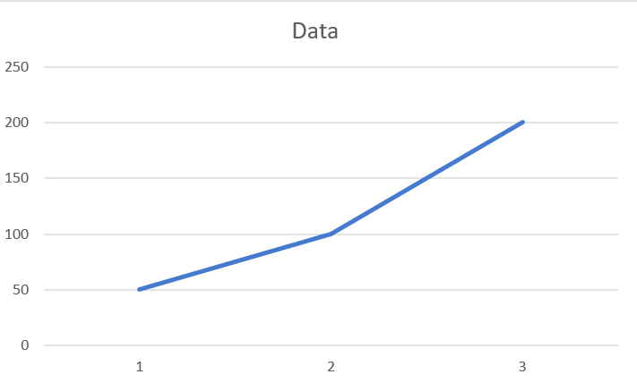
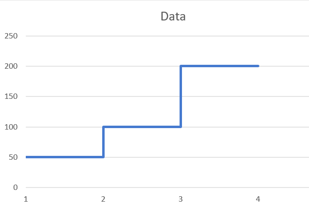
This page describes a method I use to graph data that has changes in data in particular years — say the data increases from 50 to 100 in one year and you do not want a diagonal line. I find this very frustrating. I use this example to also demonstrate some other graphing stuff. The graphs below illustrate what I do want and what I am trying to get with a very simple series. Note that this problem does not happen with regular column charts. This is one of the pages that I put up for myself because I cannot remember how it works. I cannot remember how to start the process with one value on the x-axis and then move to two values etc. In general, the method involves doubling of the x-axis and then using the INDEX function to split up the data. When you do this you want the y-axis to have different values than the x-axis after a step-up. For example in period 2, you want the first y-axis value to be from period 1 and the second from period 2. Finally, you must use an x-y graph or use the date range option in a regular line graph or an area graph.
.
Instead you want something like the graph below
.
.
.
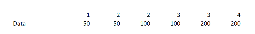
Simple Example
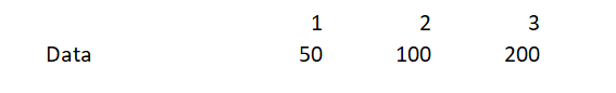
In this simple example from the above graphs, the original data was:
The trick is to re-structure the data and then either use an x-y graph or if you are using a line graph, make sure to use the date axis option. The data should be structured as a below. Be careful and use only on value for the first x-axis. Then as you proceed, use changing values for the next two items. Note that you will have to double the length of the x-axis. Note that there is only one value for the first number and then, for the second period, there are different values and that this continues.
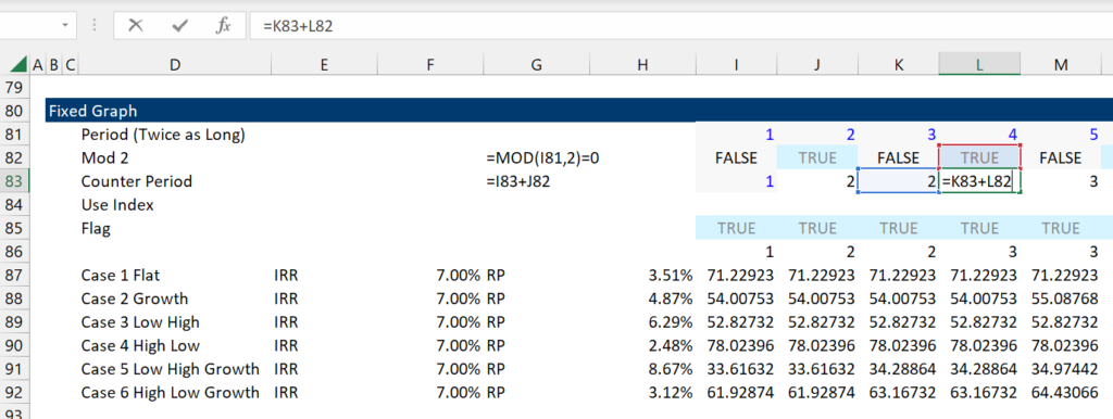
Creating a Double x-axis
To create what I call a double x-axis I create a flag with MOD(cell,2)=0. This just gives a TRUE when the number is even and a FALSE when the number is odd. Then, with the true and false I create a counter. Before doing this, I use ALT, E, I, S to create a series of data.
Be careful, when you begin there should be only one x-axis variable. Note that this process works fine with dates where you increment the dates only when the flag variable is TRUE.
.
.
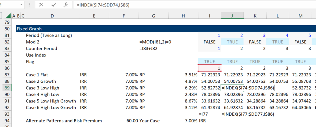
Use the INDEX with a Lagged Column Variable
When you set-up the data keep in mind that first value with the single x-axis should have a single value — in our example, there should only be one x-axis value and this should be the first vale. But after, that you can use the index. But in the second column, the index should look back to the first column. This is illustrated below.
.
.
.
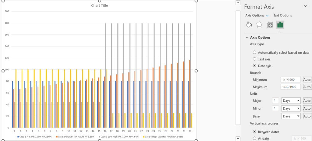
Making a Graph with the Date Axis
If you are using numbers and not dates, then excel will not automatically assume that the graph has a date axis. I did not know this until I messed around.
.
.
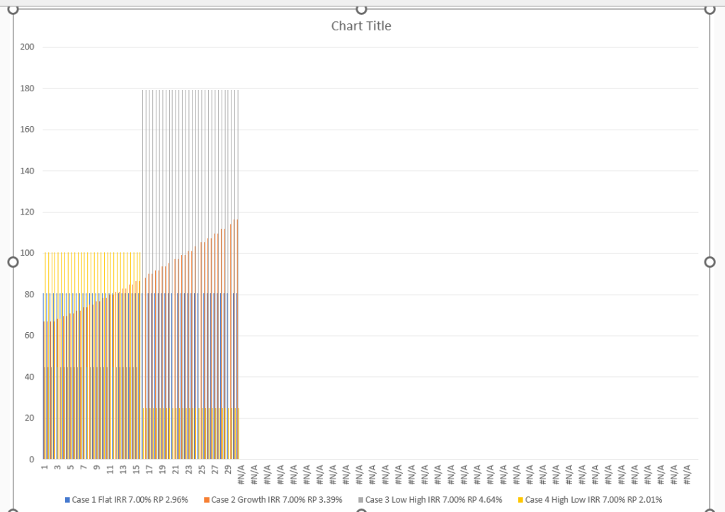
Using the NA() trick and Flexible Chart Titles
If you are using numbers, you may get something like the graph shown below. As explained above, just change this to a date axis.
.
.
.
You can use titles with one line and multiple things and you can use the NA() trick by using a flag and then adjusting the x-scale. When you are finished, you should get something like the graph below. Note that the title is flexible. To get this you just click on the title and make sure the – sign is in the formula box. Then you could.