This page demonstrates how to use the data table tool in excel and make scenario analyses. It demonstrates the difference between two-way and one-way data tables and it is the basis for more advanced subjects including using VBA instead of data tables and creating scenario analyses. I know you can find hundreds of thousands of videos and explanations of data tables on Youtube. The idea here is mainly for people who have taken my course and want to review some concepts. Data tables are something like other things in life (children for example). By the time they are teenagers you do not know if they are the worst thing or the best thing in life. So on this page I discuss whether data tables are the best thing in excel or the worst thing. Data tables take a little while to get used to and can be frustrating.
Why Data Tables are Good
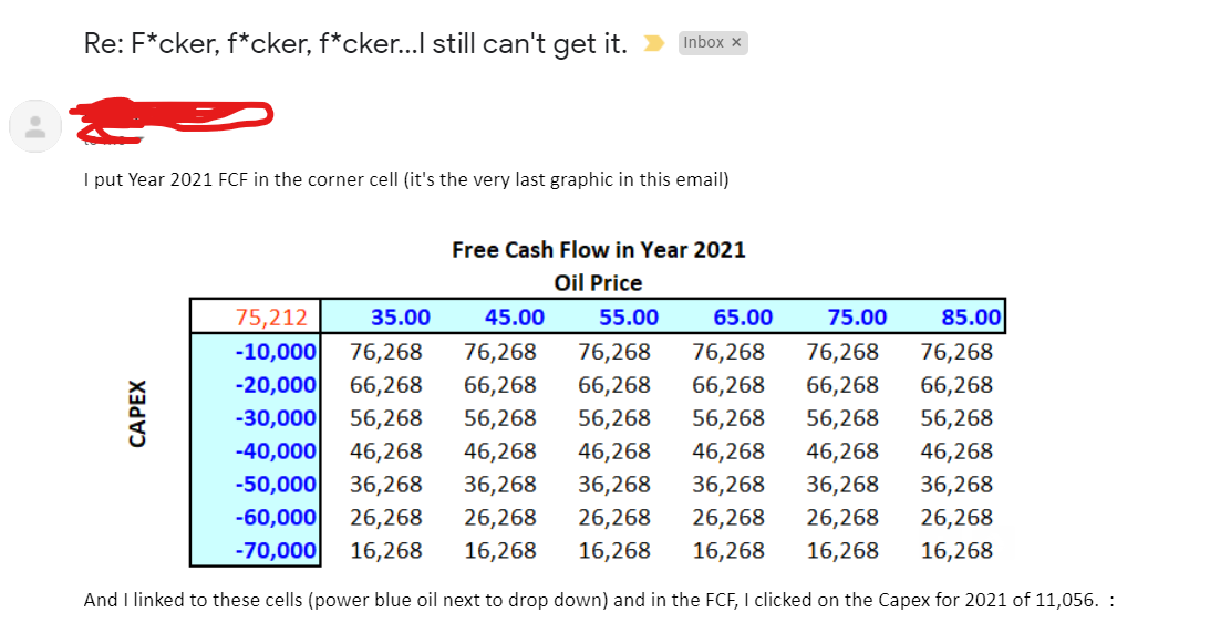
Data tables are very common in corporate finance. Perhaps the most common is a table showing the DCF value with alternative terminal growth and WACC. Data tables allow you to make all sorts of sensitivity and scenario analysis very quickly. You can even use data tables in a little creative way to create Monte Carlo analysis. When you see a table like the screenshot below, it was probably created by a data table and it can be created in seconds as long as you know the formatting and row/column connecting techniques.
Data tables do have problems as explained below. But these problems can be minimised:
- Using code numbers and making data tables with row/column numbers from codes allows you to effectively put data tables in different sheets.
- Data tables do slow down excel, but if you go to the formulas tab and use the automatic except data tables option the slow calculation problem can be reduced
- If you have spinner boxes or drop-down boxes near your data tables, you can add a very simple macro that calculates only the sheet. You can attach this to you buttons so data table only re-calculates when specific changes are made.
Why Data Tables Stink
Here is why data tables can be such a pain. Say you want to illustrate the scenario analysis you made with a nice graph. You can’t do this unless you copy the data table somewhere else. Say you open a big database file while your little file with a data table is open (even with the calculation method adjusted). This will slow things down a lot. Say you do not want to use code numbers but you want to put your sensitivity analysis in another sheet. You will be stuck. If you have a goal seek and would like to make your sensitivity analysis work with the goal seek you will also be frustrated.
To summarise some of the problems with data tables (that can be fixed by writing a macro that should take two minutes):
- Inputs for the data table must be in same sheet as the data table itself (there is a complicated trick to get around this)
- Data tables slow you down when save and open even if using automatic except data tables calculation option is selected
- When you press the F9 to re-calculate, you can mess things up even if you have a large data table
- Because of the restricted formatting when you make a data table, you cannot easily make a graph with the F11 key.
- You cannot use the goal seek with a data table where excel would somehow magically know to run the goal seek function every time the sensitivity tables are run.
- It can be a pain to put the input variables in different sheets when do not use code numbers.
- Data tables cannot be used with copy and paste macros (they can be used with the UDF method).
Before I show you how to make a VBA analysis that very quickly fixes the data tables, I will demonstrate how you can make the data tables.
Quick Review of Data Tables so You Can Become More Advanced
Two Way Data Tables
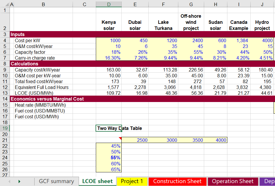
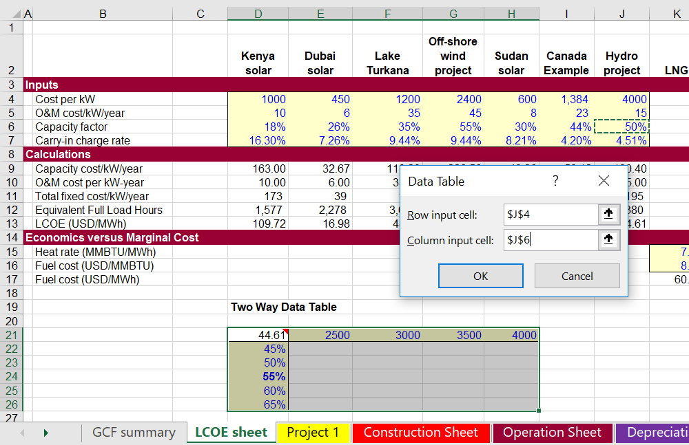
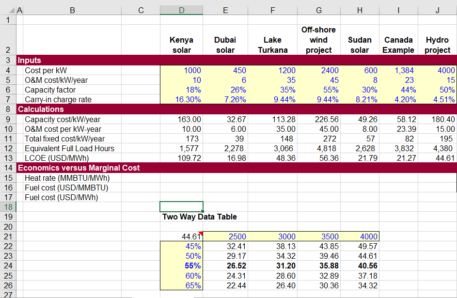
Excel describes how to make data tables in the help screen, but I did not find it very good. First, understand the logic. Excel does not have AI. It cannot magically figure how do do something unless it is told what to do. So when you type in ranges for making a sensitivity, excel does not know what to do with the ranges unless you explain what to do. The first screenshot demonstrates that you have absolutely no flexibility in setting-up the sensitivity analysis and that you are constrained by the two dimensions of a sheet. In this case you want to see what happens to the LCOE output in J13 if the cost in J4 and/or the capacity factor in J6 change. The screenshot shows that you start by entering sensitivity variables for the cost per kW in J4 and you put the sensitivity in J4. You absolutely have to put the row and columns in a manner that leaves a space between at the top left. There is no flexibility about this. The cell D20 must be between the row sensitivity and the column sensitivity.
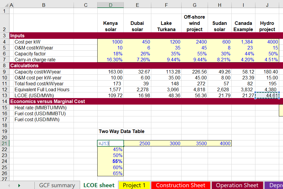
The next screenshot illustrates how you connect the output variable to the data table. The output is in J12 and this output depends in par on the input in J4 and the input in J6. This must go between the sensitivity variables in a two-way data table.
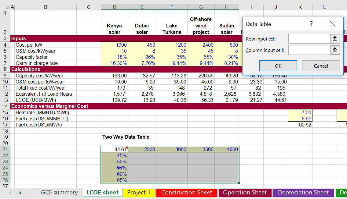
The third screenshot demonstrates how you make the data table by selecting the area and connecting the row and column input. Please not that the row and column input are not the row and columns that you put in the data table. The row and column inputs are single inputs that you drive the output variable. As shown in the two screenshots, after you select the area and select data and table, excel asks for row and column inputs.
Results of the data table are shown on the screenshot below. You may have to press SHIFT, F9 if the manual calculation option is selected or if the automatic except data tables calculation is selected. You can find the calculation option by clicking on the formulas tab. Note that the data table cannot be put in another sheet and that you cannot make a graph with F11 because of the output variable in the middle.
One Way Data Tables
Just when you have worked out data tables, you can get completely confused by trying a one way data table. This is the case where you change one variable and produce sensitivity on a whole bunch of output variables.
Video Demonstrating Data Tables in the Context of Bond Valuation
[wonderplugin_video iframe=”https://www.youtube.com/watch?v=f_t_hbLaVik” videowidth=600 videoheight=400 keepaspectratio=1 videocss=”position:relative;display:block;background-color:#000;overflow:hidden;max-width:100%;margin:0 auto;” playbutton=”https://edbodmer.com/wp-content/plugins/wonderplugin-video-embed/engine/playvideo-64-64-0.png”]
This page explains how to make different presentations of scenario and sensitivity analysis using tornado diagrams and spider diagrams. A tornado diagram can be a good risk tool because it shows the importance of different variables and it demonstrates whether there is more downside or upside risk. A spider diagram can be used when sensitivity variables are expressed as percentages (e.g.120% or 90%). Then a two way data table can be used with the percentages and the various different input variables. In creating a tornado diagram you need add a whole bunch of scenarios where each sensitivity has only variables that differ from the base case.
Creating a tornado diagram quickly involves using a combination of the data table tool and the index function. The process is helped with the TRANSPOSE function. The video below illustrates the process
Separate to scenario analysis
[wonderplugin_video iframe=”https://www.youtube.com/watch?v=UxxLMYAnWMA” videowidth=600 videoheight=400 keepaspectratio=1 videocss=”position:relative;display:block;background-color:#000;overflow:hidden;max-width:100%;margin:0 auto;” playbutton=”https://edbodmer.com/wp-content/plugins/wonderplugin-video-embed/engine/playvideo-64-64-0.png”]